MYSPACE.GRAY.net
Home | Log out
Help | Blog | Search

self proclaimed artistLast login:
4/13/09
Contacting Gray!
WIP | Block :( | Report
Gray is in your extended network!
[Grays latest blog entries] Subscribe to blogMy portfolio | VEIW MORE


Who is this individual?
Hello, i'm Gray!
I primarily speak English, However I speak a lot of Spanish and know some Italian.
I'm mixed
I'm OBSESSED with music!
I want to leave a legacy behind.WHO ID LIKE TO MEET
People in the Industry


GRAYS Inspirations
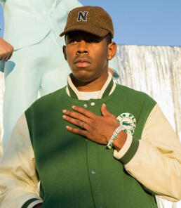
TYLER, THE CREATOR
My portfolio
Certain materials are included under fair use exemption of the U.S. Copyright Law and are restricted from further use.


Color emphasis

Simple selection tool project

Advanced selection tool project

Frankenstein project

BRUSH COMP

Advertisement project

Event poster

Album cover

back of cover

Illustrating a photographic image

Recolor Project

Cartoon yourself project

perspective city project

Low poly portrait

Monogram logo

Still Life Composition

Front of Business Card

Back Of Business Card

Infographic Final
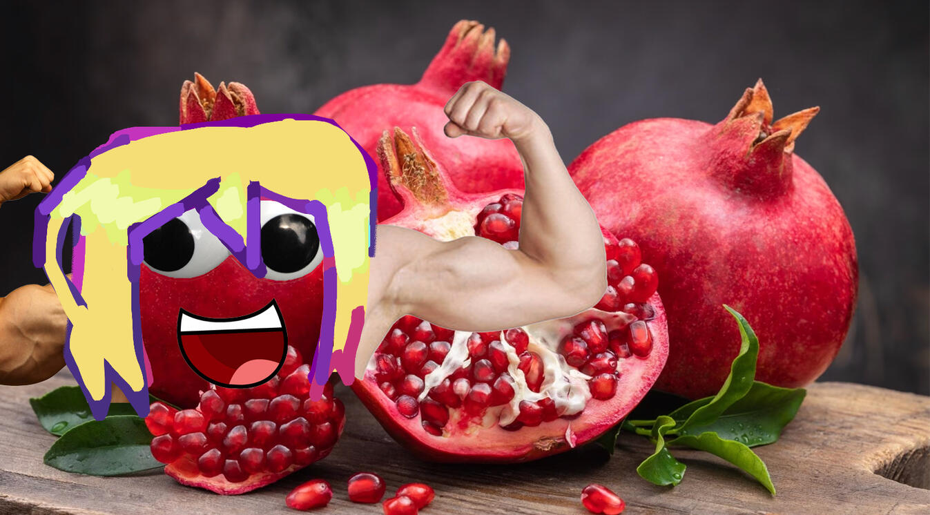
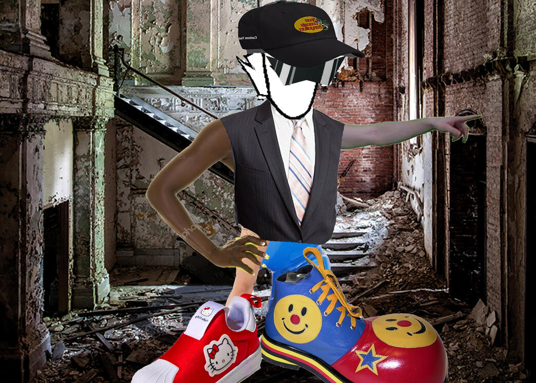
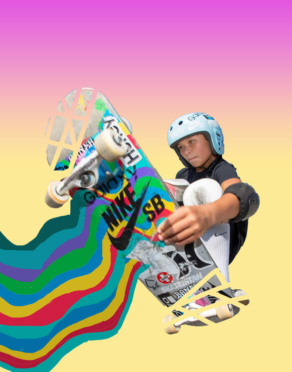
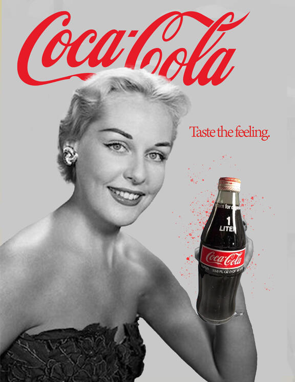
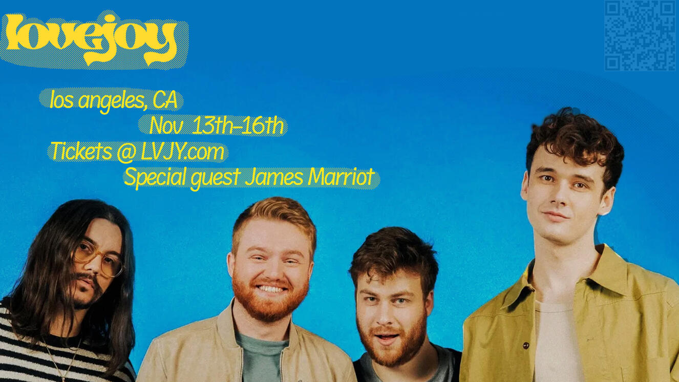
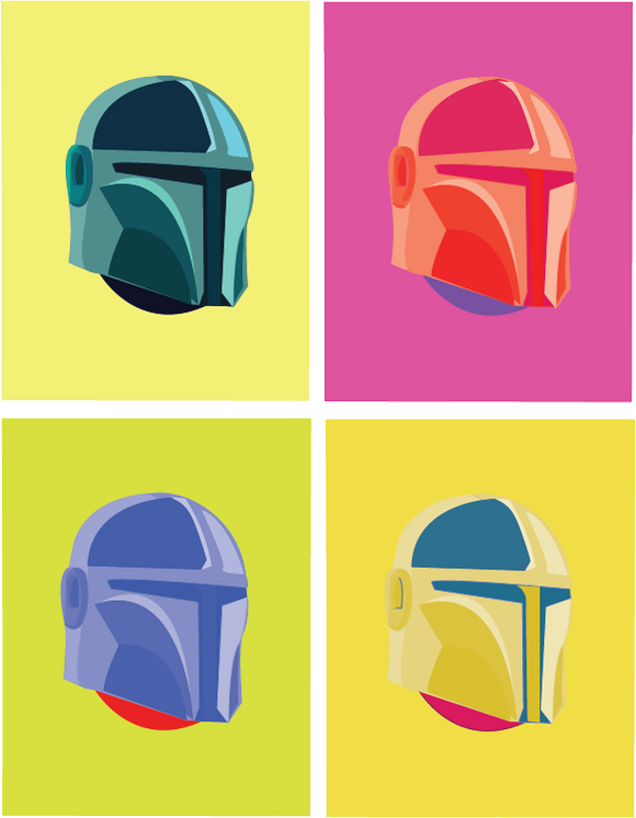
The frankenstein project required us to put together different images to create a new person. All 10 parts are included.The Brush COMP project required us to select an image, play with gradients, and add and subtract to the image. I added onto the board and also chopped up some parts of it.The Advertisement Project required us to choose a brand to advertise and make a poster-style ad for them. Along with this, we had to use their slogan.In the event poster project we were required to choose a band or
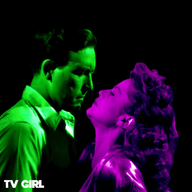
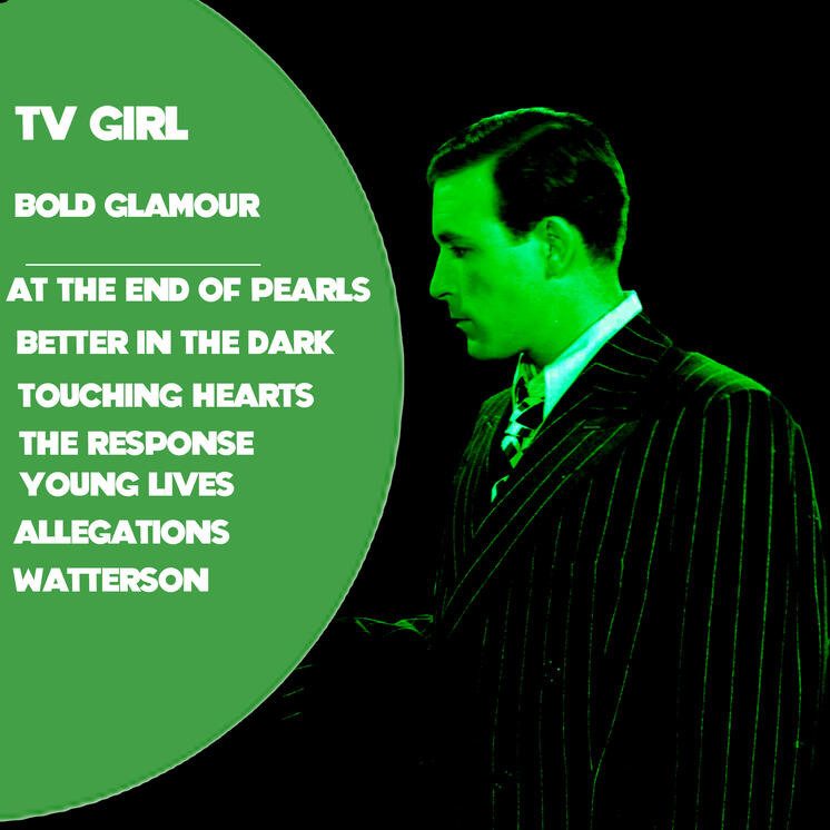
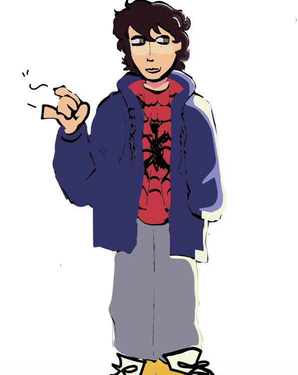
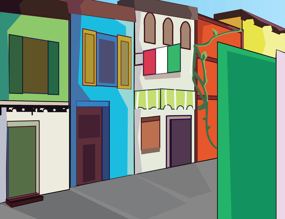
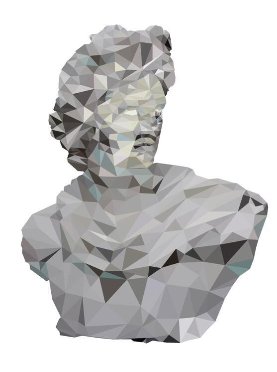
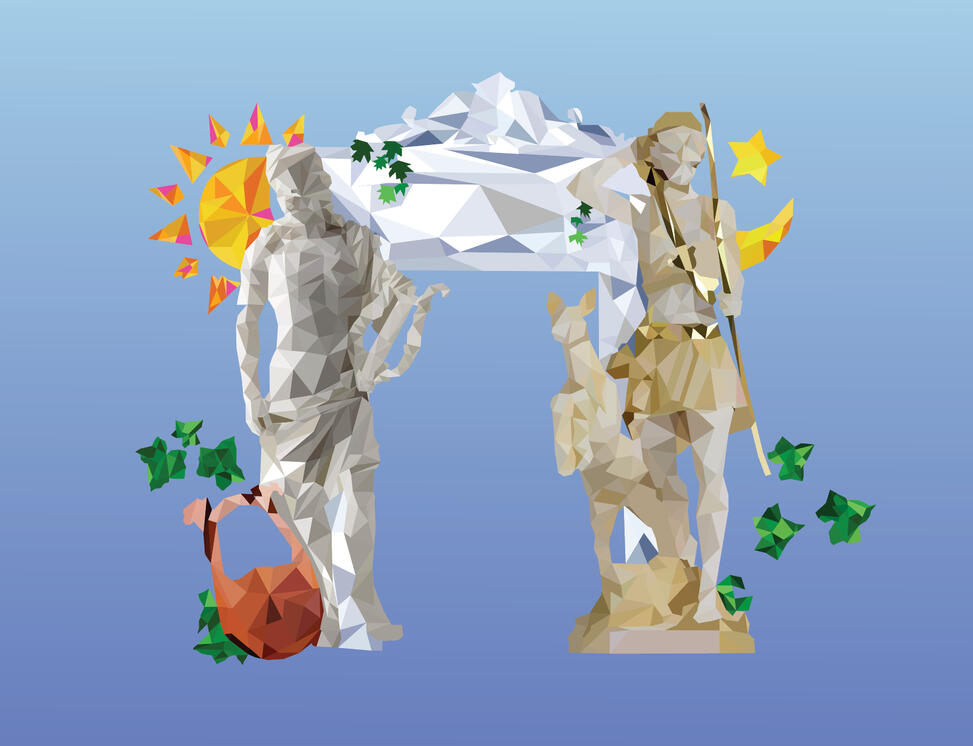
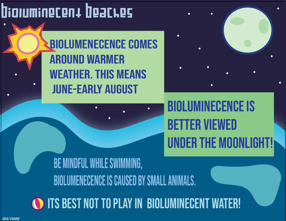
celebrity to base an event around.In The album cover project we were required to make a cover for a made up or existing band. I decided to do TV girl with clips fromThe Photographic image project required us to convert a dynamic image into a VECTOR on Illustrator. It was the first Illustrator project.In our perspective city project we were required to use the perspective grid tool and make six buildings.In our low poly portrait, we used our knowledge of the pen tool from our poly-practice project to do a bust of a person or statue.For our Monogram Logo assignment our class had to design. a monogram logo using our initials. After some pondering I came up with a four leaf clover. Using The l as the stem and the G's as the petals. GL is usually used as a abbreviation for goodluck - which inspired the clover.For our Still life composition the theme was opposites; I decided to do Artemis and Apollo. For those who don't know, They are figures in greek mythology and although they are twins they are VASTLY different. Artemis is god of the hunt and associated with the moon while Apollo is the God of the Sun and Music.For our Business Card assignment, we chose a color based on emotion and designed a card for whom we want to sell to. I decided on the color green after making the clover. I would want my customers to feel homely and safe when trying to work with me. A customers trust should always be at the forefront. I referenced 1960's business cards for he layout and fonts, as-well as old police cards.For our final project, We had to make an infographic. For my infographic I decided to base It around Bioluminescent beaches. I chose this subject because one of my fellow graphic design students had brought it up. I adore the beach and was naturally curious, and put some of my findings in this project as-well as an article I wrote for the schools press website.

In this project we had to create a recogniseable face using a certain genre of objects or things. I chose electronics.
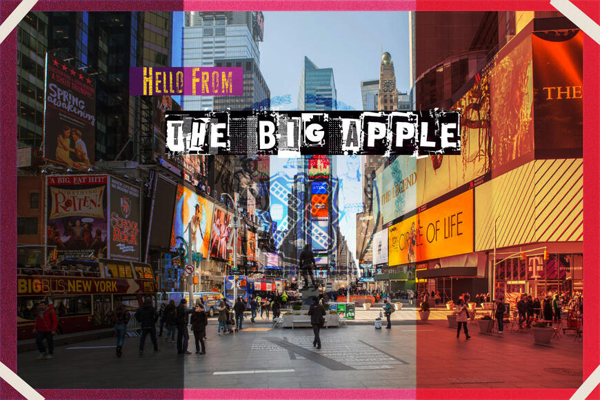
Postcard Project - For this project we expirimented with blending layers aswell as effects and text options.
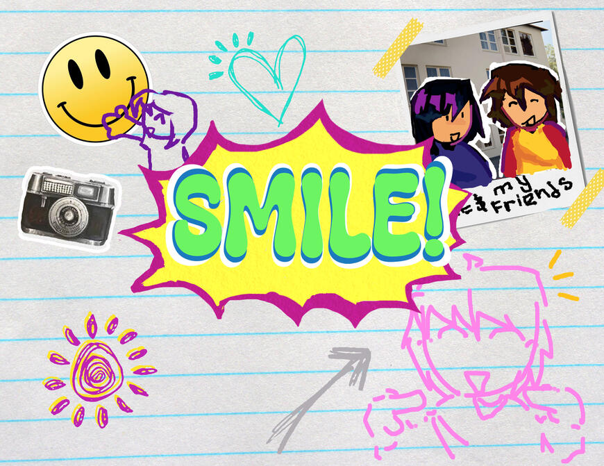
Illustrated word project - We tried to visualize word through. textures, brushes, and fonts.
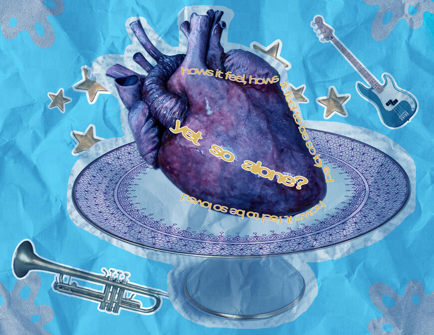
Typography quote project - In this project we played around with text styles. We had to choose a qoute from someone or a song and try and visualize it.
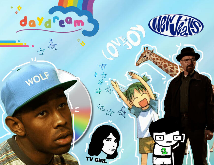
Self portrait - In this project we had to make a collage of images we think represent us as people. For this project, I decided to make it more music based with references to things I like. Ex; The leaves from Heartstopper.
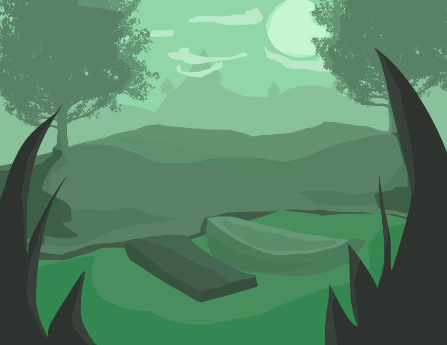
Value landscape project - In this project we were given a monochromatic pallete going from lightest to darkest to create a scene with light value.
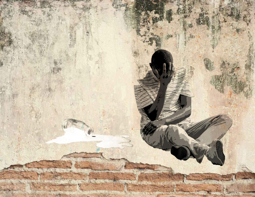
Banksy Graffiti Project - In this project we did a Banksy inspired graffiti edit. For mine I did a man crying over spilt milk.
